How to Design an Event Registration Experience That People Finish
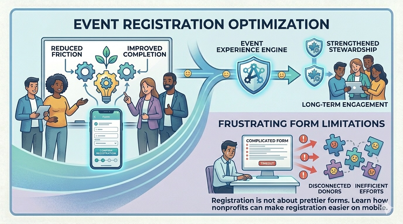
Nonprofit teams often spend months planning an event and only a few hours thinking about the registration experience itself. That imbalance is understandable. Venue logistics, sponsorships, ticket structure, hosts, seating, and communications all demand attention. But registration is not a clerical detail. It is the front door to the event.
If the experience is slow, confusing, or fragile on mobile, many organizations lose momentum before the event relationship even begins.
This matters because digital behavior is now clearly mobile-heavy. M+R Benchmarks reported that mobile users accounted for the majority of nonprofit website visits in 2024, even though desktop users still produced more transactions and revenue overall. For event registration teams, the implication is straightforward: the form has to work elegantly on phones even if some larger gifts or more deliberate purchases still happen on desktop.
Begin by deciding what absolutely belongs on the form
A common registration mistake is trying to collect every useful detail at once. Teams ask for meal preferences, guest names, company titles, table assignments, accessibility needs, custom questions, marketing preferences, and follow-up interests in one long sequence. Some of that information may be necessary. Not all of it belongs before the submit button.
A better principle is progressive disclosure. Collect what is essential to secure the registration and payment. Gather the rest later when it is operationally safe to do so.
At minimum, most forms should make the following easy:
· selecting a ticket or registration type
· understanding price and inclusions
· adding guest information only when relevant
· entering contact and payment details clearly
· receiving an immediate confirmation with next steps
Everything else should be tested against one question: does this field materially improve execution enough to justify the added friction?
Price clarity is part of user experience
Supporters abandon registration flows for the same reason consumers abandon e-commerce carts: uncertainty. If the registration structure is confusing, confidence drops.
That uncertainty usually appears in a few places:
· unclear differences between ticket levels
· add-ons that appear late in the flow
· guest logic that changes total price in surprising ways
· insufficient explanation of what is charitable, what is taxable, or what is simply a purchase
· forms that reveal fees too late or do not explain them well
For nonprofit events, clarity matters even more because the transaction can carry fundraising implications. If there is a charitable component, teams need to be especially careful that the registration flow aligns with finance and acknowledgment logic. Even when no tax receipt or acknowledgment issue is involved, the participant should still understand what they are paying for.
The strongest registration flows are built for motion, not only for data capture
Good forms respect the fact that many users register while moving between tasks, on a phone, in a hallway, or during a workday. They are not sitting down to admire your interface. They are trying to complete a commitment they already intend to make.
That means the registration path should be:
· visually calm
· easy to scan
· explicit about progress
· resilient on smaller screens
· forgiving when a user makes a mistake
The best event forms do not feel clever. They feel obvious.
This is one reason it is useful to design around a small number of strong decisions rather than a long list of micro-choices. Let the user select the registration type quickly. Let them see the total. Let them complete the action without wondering what comes next.
Guest management deserves special care
Guest flows are one of the most common sources of registration friction. The organization wants accurate guest details early, while the purchaser may not yet know every name, email, or meal preference.
For that reason, guest workflows should be flexible. If the event permits it, allow the purchaser to complete the transaction first and return later to finalize guest details. The confirmation message can explain exactly how and when to complete that information.
This is a small design choice with large operational benefits. It protects conversion while still giving the organization what it needs before the event date.
Confirmation is part of registration, not an afterthought
Too many teams treat the confirmation email as proof that the registration happened and nothing more. In practice, confirmation is the first stewardship touchpoint after commitment.
A strong confirmation message should:
· reassure the registrant that the submission succeeded
· summarize what was purchased or reserved
· clarify what happens next
· explain any guest or profile completion steps
· set expectations around reminders, check-in, parking, receipts, or acknowledgments as appropriate
If the event is mission-connected, the confirmation can also remind the participant why the event matters. That should be done with restraint, but it is often the right moment to begin shaping post-registration engagement.
Accessibility should not be treated as optional polish
Registration forms should also be evaluated through an accessibility lens. W3C's WCAG 2.2 guidance remains the international standard for web content accessibility and is directly relevant to forms, focus order, labels, error handling, contrast, and mobile interaction. If a registrant cannot complete the flow with confidence using a keyboard, screen reader, zoomed interface, or assistive tools, the organization is excluding people before the event even begins.
This is not only a compliance or equity issue. It is a quality issue. Accessible forms are often clearer forms.
Registration design affects what comes after the event
The registration experience also shapes downstream data quality. If the form structure is inconsistent, if guest relationships are ambiguous, or if segments are captured poorly, the organization pays for it later in seating, check-in, post-event follow-up, and reporting.
This is why the best event registration design is operational, not merely visual. The right question is not, "Does the page look modern?" It is, "Will this produce clean participation data and a smooth attendee experience from sign-up to follow-up?"
A finished registration is not the end of the journey. It is the start of everything the organization hopes to do afterward.
If your event forms are creating avoidable friction for guests and extra cleanup for staff, the issue may be structural, not cosmetic. Altrinum helps nonprofits manage event registration, guest handling, and follow-up in a cleaner workflow.

